Why Tasmanian light changes everything
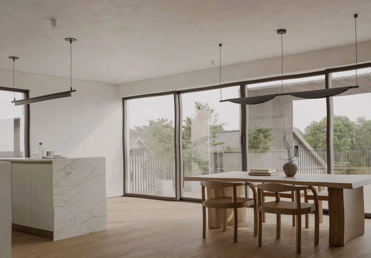
Most paint marketing is photographed in bright, warm, northern-hemisphere-style light. Hobart gives you cooler ambient light for most of the year, with long low sun angles in winter. Warm whites hold up beautifully here. Cool whites can drift grey and slightly sad by 3pm in July.
The same logic applies to bold colours: they read deeper and moodier in our light, which is usually a win if you picked them on purpose.
The sample board method we use on every job
Forget the tiny swatch cards. On every project we paint A3 boards with two coats of the actual product and live with them for a few days:
- Tape boards to the wall that gets morning light and the wall that stays in shadow.
- Look at them at 8am, noon and under your evening lamps.
- Move them next to fixed finishes: floor, benchtop, the sofa you are keeping.
A colour that survives all three tests is a colour you will not repaint in six months.
A colour that survives morning, noon and lamplight is a colour you will not repaint in six months.
Undertones are the whole game
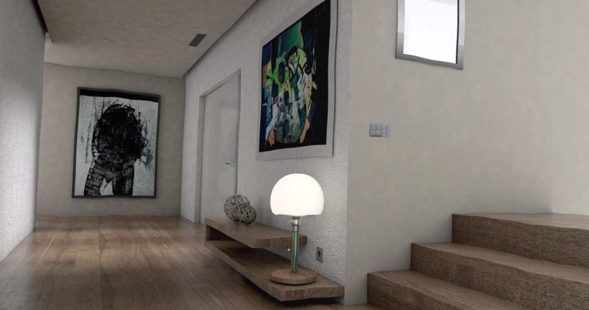
Every neutral has an undertone: pink, yellow, green or violet. The trick is matching undertones to the fixed elements in the room. Tasmanian homes often have warm timber floors and sandstone or brick, which favour warm and pink-based neutrals. Pair them with a cool grey and everything fights.
When clients bring us a Pinterest palette that feels off, the undertone mismatch is almost always the culprit.
When to bring in a consult
If the repaint involves more than two rooms, or the existing finishes have strong undertones of their own, a colour and materials session usually pays for itself in avoided mistakes. Two hours, a finished palette, and a spec sheet your painter can follow without a single phone call.